Wednesday, August 27, 2008

Gorgeous Groupings

[Photo credit: Sfgirlbybay via Apartment Therapy]

Know what's my favorite part of interior design? Vignettes. They're what I hone in on first when flipping through magazines or watching a design show 'reveal'. And I swear I could create them all day long if you let me! Back in the day as an editor, I was fortunate to learn from some of the best fashion photographers the art of styling still-lifes to sell product. Well, the same concepts hold true for your home. So here is my 5-step primer:


[Photo credit: PaperPony (left) and Sfgirlbybay via Apartment Therapy (right)]

1. A theme is a good starting-point. For example, the vignettes above tell a color story - reds and browns to the left and greens and blues to the right. In the opening photo, the pottery collection seems to be about rounded shapes and smooth textures.

2. Mix it up. In the photo above, the ordered arrangement of the markers and books is balanced by colorful 'chaos' of craft supplies and personal mementos. In the photo below, a small bust and slim figurine balance the angularity of the framed photos.

[Photo credit: PaperPony]

3. Take heed of height. In the final two photos below, notice that your eye gradually moves down from the tallest item to the shortest and there is no stark white space. This creates a pleasing composition.


[Photo credit: BitsandBobbins (left) and Christine Chitnis via Design*Sponge]

4. Grab your digital camera and start snapping. Photographers always assess image composition and quality of light before actual shooting. Your photos allow you to do similarly by creating 'distance' between how you perceive your vignette and how it actually looks.

5. And of course, play around and have fun. To me, vignettes are so personal and give little clues about a homeowner's interests and passions. It's not brain surgery so if you get bored switch things around. Add or subtract items. Just make it you!

Friday, August 22, 2008

Food For Thought


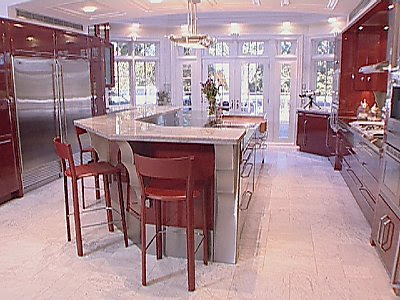
[Photo credit: I Want That! Kitchens/HGTV]

Is the luxe kitchen is losing its luster? You know, the 'modern' kitchens revealed ad nauseum on our favorite design shows where the old solid wood cabinetry "just had to go" or walls had to knocked down to improve flow. Of course, we all enjoy the resultant eye-candy. But sometimes I can't help but wonder, "is it all worth it?" Like the episode of Moving Up where the homeowners spent over $150,000 on a new kitchen! Hello, what ever happened to reduce, reuse, recycle?


[Photo credit: ReadyMade Magazine]

I was therefore thrilled to see in Ready Made magazine (via Apartment Therapy) the kitchen of Angela Medlin. Designed almost entirely with salvaged materials, her hearth is the antidote every granite-topped, travertine-tiled, stainless-steel-applianced kitchen in America! While I know this look is not mainstream, I think Medlin's awesome work demonstrates that you can create a warm and inviting kitchen with elbow-grease and a little ingenuity.


In our home, the simple act of moving the fridge about three feet away from the window and mounting two shelves (the top one not exactly straight ;-) has made a big impact. Originally stained cherry-red, we painted the shelves to match the wall color and now use them to house appliances and supplies. An IKEA magazine rack was added to organize larger cookbooks and voila - a useful prep niche!

What is your idea of a dream kitchen? If money were no object would you choose homey and functional or is bling your thing? Let me know what you think! :-)

As always, have a great weekend!

Monday, August 18, 2008

Bold Moves

[Photo credit: Valery Hache/AFP/Getty Images (left); AP Photo/Luca Bruno]

A very Happy Monday everyone!

So, last week I confessed that the Olympics has me hooked. Well this weekend I pretty much went nuts as Jamaica won Gold medals in both the men's and women's 100 metres. The ladies did a clean sweep while Usain Bolt clocked a world record 9.69 and Trinidad and Tobago's Richard Thompson nabbed silver. Big up my Caribbean peeps!

So what does all this have to do with interior design? Why an awesome color combo, of course! Black, gold and green is a snappy palette that looks really fresh when paired with bright white. Whether it's a sunny yellow chair; a graphic tome; or a sassy paper suitcase, this bold palette will certainly add zing. Enjoy!


Top Row (left to right):
Diner Cups - Urban Outfitters; notNeutral 3 Leaf Hurricane - 2Modern; Green Ceramic Imperial Horse - Z Gallerie.
Middle Row (left to right):
Mini Suitcase - Kate's Paperie; New York Times Little Black Book of Crosswords - Z Gallerie; Herman chair - IKEA.
Bottom Row (left to right): Tea Towel (Teacups) - ThreePotatoFour; Ovation vase - IKEA; Hybrid-Home Limited Edition Oma + Olaf Owl - Design Public.

Wednesday, August 13, 2008

Clear Winners

[Photo credit: Olivier Morin/AFP Photo]

Are you suffering as I am from Olympics-mania? Although I was rather ambivalent during Athens/2004, this time around, China has me riveted.


[Jason Lezak photo by Mark J. Rebilas / US Presswire]

From the spectacular opening ceremony (gotta love the ombre costumes above) to Jason Lezak's awe-inspiring performance in men's 4 x 100 swim relay, I have athletics on the brain. And my kids love it too. It's like a live geography lesson! Who knew Andorra, Comoros and Tuvalu existed?


[Photo credit: West Elm]

When I'm not thinking about gymnastics, my 'me-time' thoughts turn to a handful of re-design projects I'm working on. While shopping the market this weekend, I was tickled to see West Elm offering cable-knit pillows. Think they read my previous post on sweater pillows? :-) Designed in collaboration with Lutz & Patmos, a New York-based luxury sweater and knitwear brand, these pillows look super cozy.


[Photo credit: Pottery Barn]

Not a trend-setter? Pottery Barn delivers a pared-down version of the look too. Cute!

Friday, August 8, 2008

Persistence Does Pay Off!


Pull your chairs up folks, this is going to be a long one. You see, about 3 years ago I bought a cute baby-blue sewing machine with visions of sewing little outfits for my daughter. Although I had some sewing experience (primarily hand-sewing), after purchasing the machine I realized I was clueless about actually operating one. Overwhelmed into inaction, I simply put it away until I found a 'chance' to use it.

Fortunately, while assisting my sister-in-law in making a slip-cover for my sofa this spring, I had a light-bulb moment that this wasn't brain-surgery! So, I began by observing the little things my sister-in-law would do like threading the bobbin; changing a broken needle; or sewing a zig-zag stitch. After she went home, I would give myself 'homework' and try to pick up where she left off and even referenced the manual occasionally to solve problems. The latter was very excruciating for me. However, ever so slowly my confidence increased as I would do little projects to challenge myself.

So, imagine how proud I felt yesterday when I successfully recovered this canvas tote! The tote is a few years old and looked the worse for wear so I revamped it using leftover fabric from the slipcover project. With a hastily-made pattern of the tote frame and a couple of fittings, this was the result:


Although I had a few hiccups along the way, I followed my Granny's mantra,"learn to leave good enough alone." Wise words I tell you! I fixed what was important and left minor imperfections as-is.

Hopefully my opus will inspire you to face a daunting task head-on. Really, it's not about having great skills, it is about overcoming your fears and breaking things down into manageable chunks that give you a sense of accomplishment - not frustration. Sometimes attaining perfection isn't the endgame but rather the pride in completing a project to the best of your ability.

Have a great weekend!

Monday, August 4, 2008

Tempted to Touch


Happy Monday Practicalistas!

This month's House Beautiful features the gorgeous abode of photographer and designer, Victoria Pearson.


With a love of all things woven, Pearson has achieved a sumptuous layered effect with textural touches that include sisal rugs; a woven headboard and lampshades; and plenty of baskets.


Laid-back and unpretentious, this my definition of a gracious home! For more pics, click here.

[Photo credit: Victoria Pearson for House Beautiful]